.2Design
Menu
Miduty: Website Redesign
Miduty is a cutting-edge nutraceutical brand that has revolutionised the health and wellness industry. With a relentless commitment to scientific innovation and premium quality, Miduty has emerged as a trusted name in the field of nutritional supplements. Driven by a passionate team of researchers, Miduty leverages the power of nature and scientific advancements to create a diverse range of products that cater to the unique needs of individuals seeking optimal health.

Overview
Miduty represents a groundbreaking nutraceutical company that has transformed the health and wellness sector through steadfast dedication to scientific progress and exceptional standards
The Problem
Miduty lacked a strong online presence and effective digital platform to connect with their target audience and showcase their products. The absence of a well-designed website hindered their ability to effectively communicate their brand values, product offerings, and the scientific innovation behind their formulations. Potential customers were unable to access comprehensive information about Miduty’s products, leading to a missed opportunity for engagement and sales.
The Solution
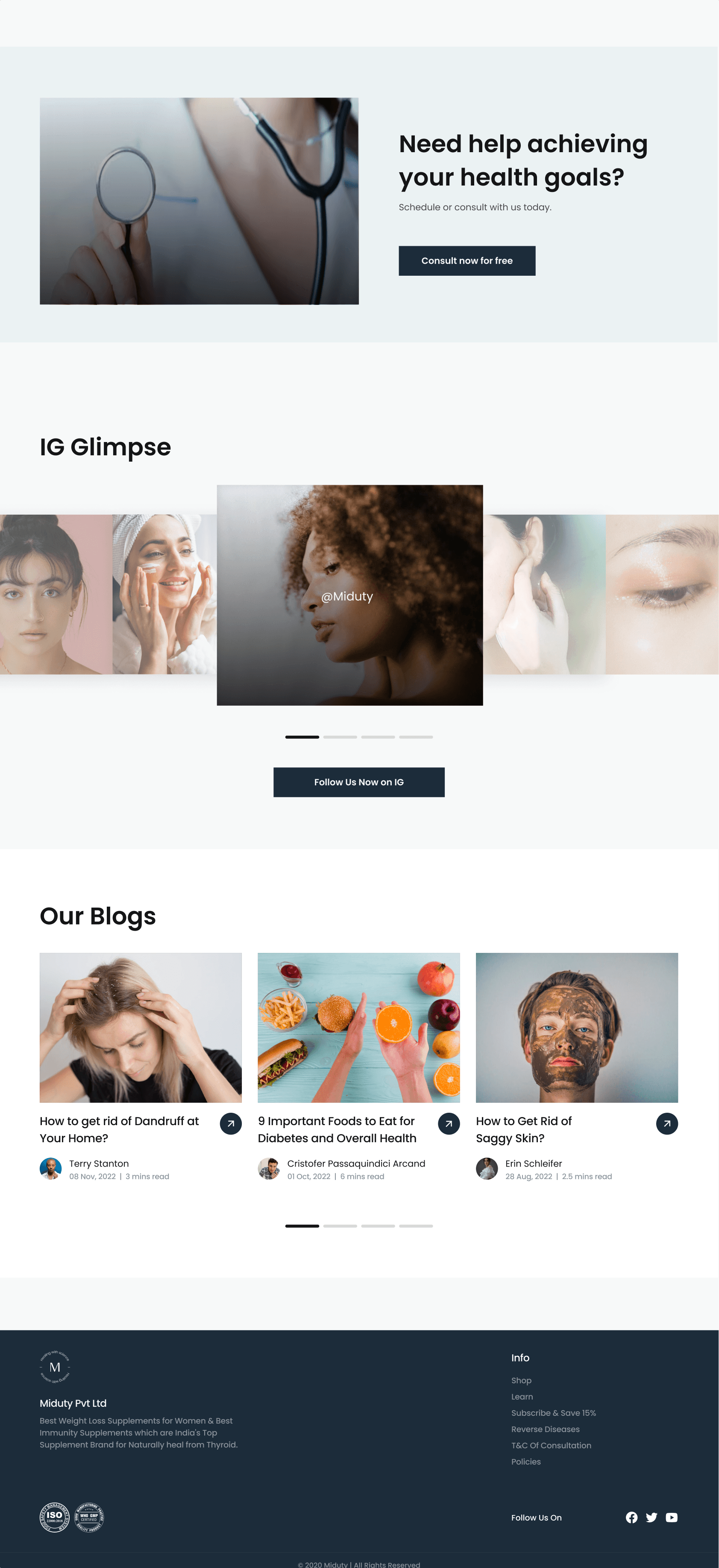
The website was designed to align with their brand identity, featuring a clean and modern layout. We implemented a strategic approach in designing the website, focusing on converting visitors into the clients in Miduty’s services. The ultimate goal was to keep the clients and buyers happy and provide them with the right amount of information they needed.

Previous Design
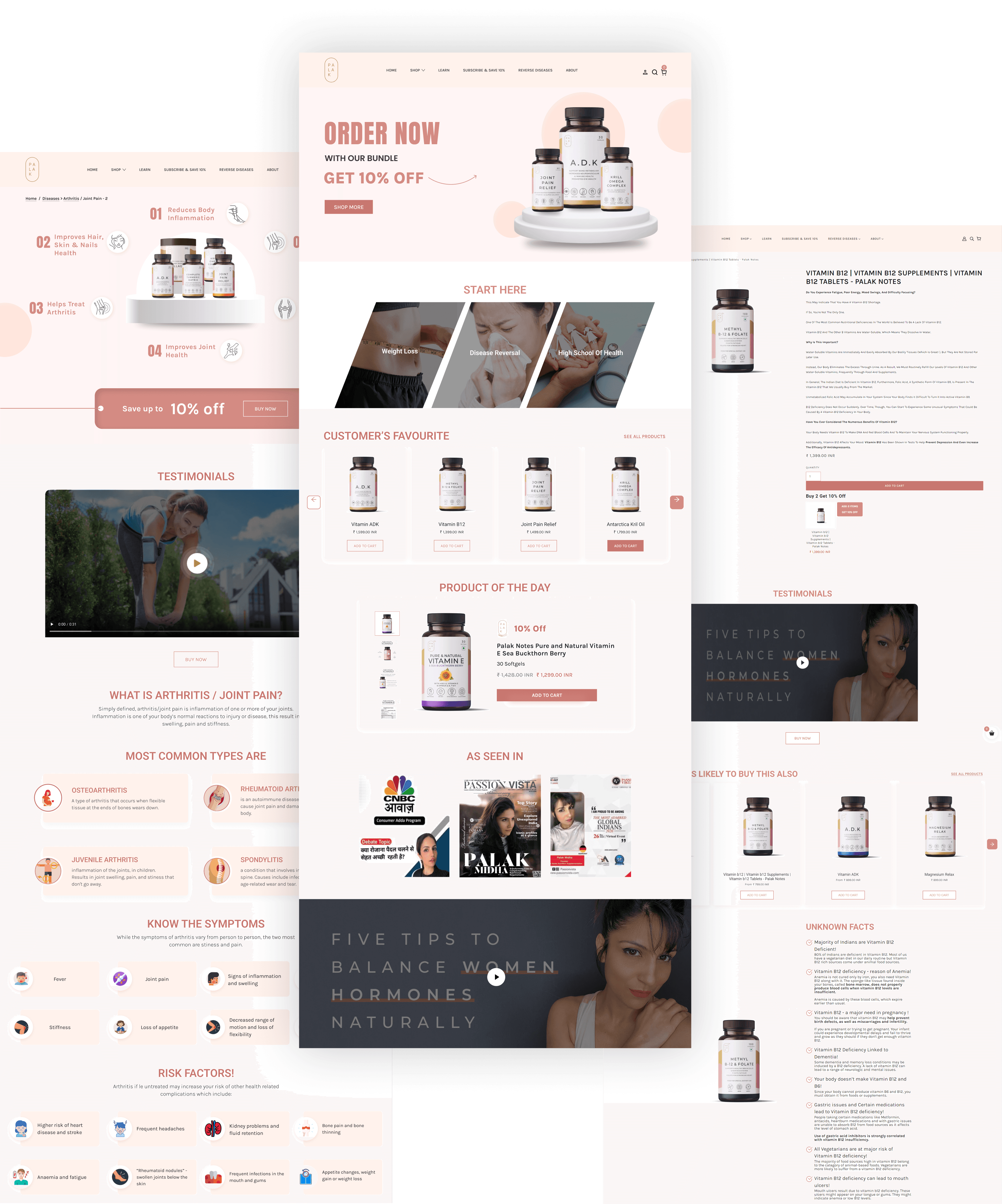
What we Identified…
The previous website exhibited several significant issues that compromised its effectiveness and professionalism. These issues included:
Inconsistent Brand Language and Tone
The website's brand language and tone did not align with the desired image of the brand. Inconsistencies in messaging and tone can confuse visitors and detract from the overall brand identity.
Disorganized Information Placement
The presentation of information was haphazard, leading to difficulties for users in locating and comprehending the content. This hindered the user experience and potentially resulted in missed opportunities for engagement.
Cluttered User Interface
The user interface lacked a sense of organization and visual hierarchy. This resulted in a cluttered appearance and made it challenging for users to identify key information and actions.
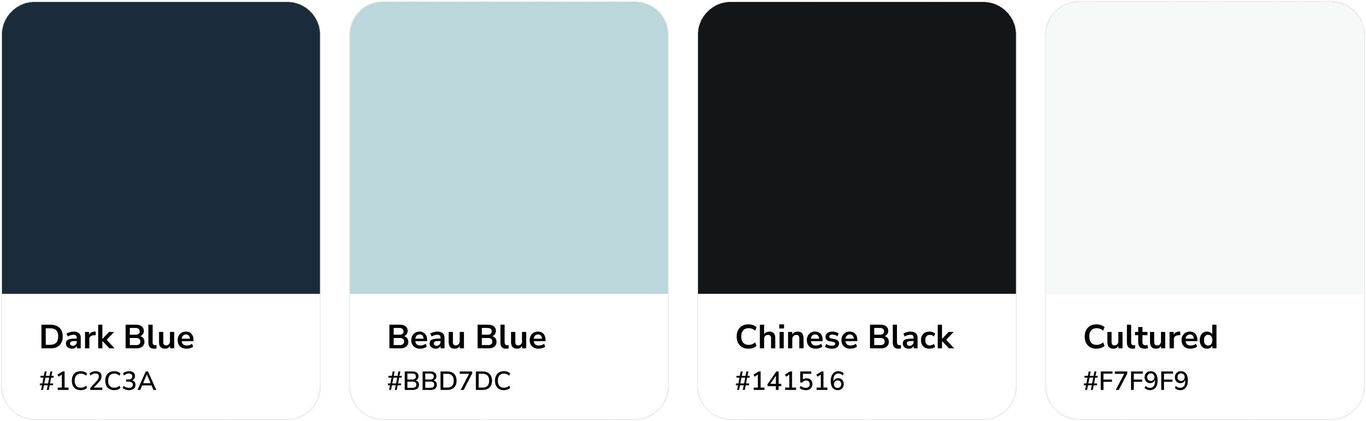
Branding
The new brand tone is "SERIOUS AND SCIENTIFIC", conveying a sense of precision and expertise.

UI Explorations


New Design


Handoff & Quality Analysis
After completing the design phase, the designs were handed over to the development team for implementation. To maintain the high standards and expectations set during the design phase, we will stay closely involved throughout the development process. Our team will conduct regular calls with the developers to ensure the final product aligns with our vision and goals.

